Negative Fill Lighting: Why Subtraction Gives Commercials Shape
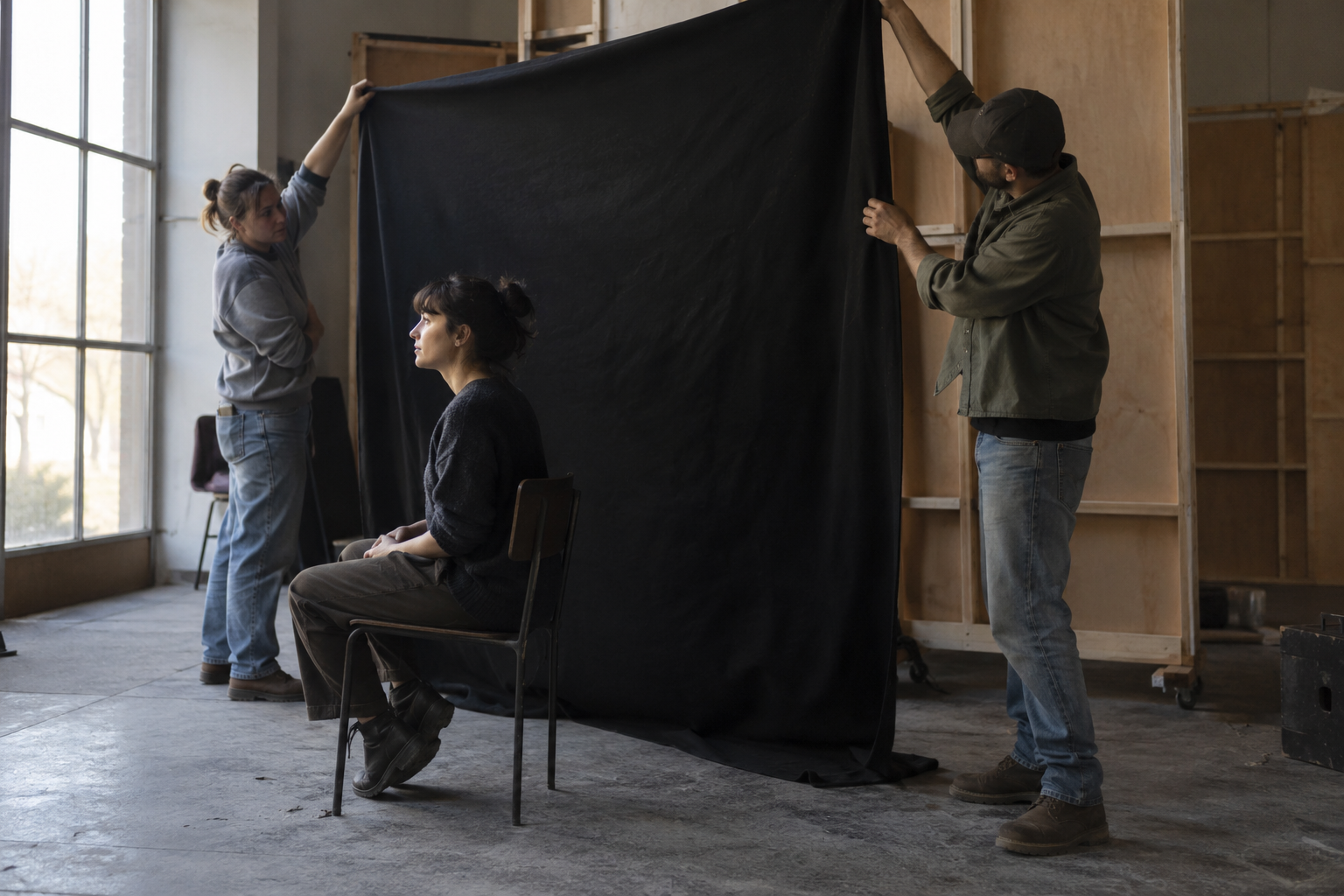
A commercial can have plenty of light and still lack definition. The performer is visible, the set is evenly exposed, and every surface carries roughly the same weight. What the image needs may be a more deliberate shadow.
Negative fill lighting addresses that problem by reducing unwanted reflected light. Its appeal extends beyond contrast: it gives cinematographers another way to decide which parts of a face, an object or a room deserve emphasis. For commercial work, that decision connects the physical set to the character of the campaign.
A black surface beside a performer is an unglamorous sight behind the scenes. In the finished frame, its contribution can be a face with more shape, a cleaner separation between materials, or a scene that keeps the atmosphere of the location without surrendering its visual direction.
Negative fill changes the relationship between light and shadow
Light arriving at the shadow side of a subject often comes from its surroundings. Pale walls and other reflective surfaces return illumination into areas the key light does not directly reach. Negative fill introduces an absorbing surface into that relationship, reducing some of that return.
Cinematographer Neil Oseman’s account describes black material, boards and solids as tools for lowering fill and increasing contrast. His examples include an interior where a white wall behind the camera was covered to control the light returning toward the actors.
The useful distinction is between making an entire image darker and changing where light arrives. Lowering exposure affects the whole frame. Controlling reflected light can alter the balance within it. The creative value lies in that local relationship: a highlight can retain its presence while the adjacent surface becomes quieter.
That does not make deeper shadows an automatic improvement. An image with generous fill can feel open and direct. A more sculpted image can feel restrained or intimate. Neither treatment belongs exclusively to a particular industry or budget. The choice needs to make sense beside the performance, production design and message.
Contrast is part of the brand conversation
Consider a hypothetical commercial built around a founder speaking from a workshop. The room contains pale walls, workbenches and a large window. A fully open shadow side might help the space feel approachable. Reducing some ambient return could give the face greater definition while keeping the daylight believable.
Those are different interpretations of the same scene. A useful creative conversation concerns how the person should feel to the audience: accessible, absorbed in their work, candid, authoritative. Asking for a more “cinematic” picture leaves that intention vague. Describing the desired relationship between face, space and shadow gives the team something more specific to pursue.
There is also a practical limit. The audience still needs to read the expression. A beautiful silhouette can undermine a conversation-led spot if the emotion depends on seeing the performer’s eyes. Negative fill earns its place when it sharpens the intended emphasis without making the important information harder to see.
Reflective products make the surroundings visible
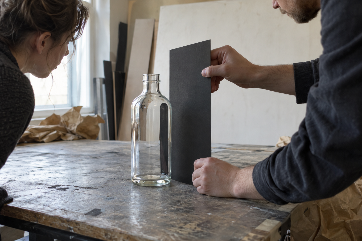
The same question becomes especially apparent with glass and other reflective surfaces. Their appearance includes the environment around them. A bright return can spread across an object; a dark surface can contribute a more defined edge or reflection. The Corning Museum of Glass’s photography account documents how surrounding surfaces and black cards control reflections in glass objects.
In a hypothetical bottle campaign, black card beside the product might help its contour read against a pale setting. That visual decision would still need to respect the actual packaging, liquid and label. An attractive dark edge is of little value if the product becomes difficult to recognize.
This is where lighting and art direction become closely connected. A surface outside the camera’s composition can still influence the object inside it. The finished image may look simple because the crew has made careful choices around the frame, including choices the audience will never see.
The supporting illustration shows that work rather than a supposedly finished campaign photograph. It is a fictional material study, not a measured demonstration of a particular lighting ratio or proof of a client result.
Naturalism can involve substantial control
A scene that feels available-lit may have been shaped extensively. The aim can be to preserve the apparent source while controlling how much illumination returns from other directions.
In Jon Joffin’s account of Keep Breathing, published by American Cinematographer in August 2022, he describes using solids for negative fill on daylight exteriors while retaining detail in the shadow side. The interview makes clear that restraint and visibility can coexist.
For a commercial, that balance matters whenever a location supplies part of the story. The texture of a working room or the openness of an exterior may be worth keeping. Light control can refine the image while allowing the place to retain its character. The particular choices remain dependent on the scene; a television production’s solution is a reference for judgment, not a recipe for every campaign.
The look has to survive the performance
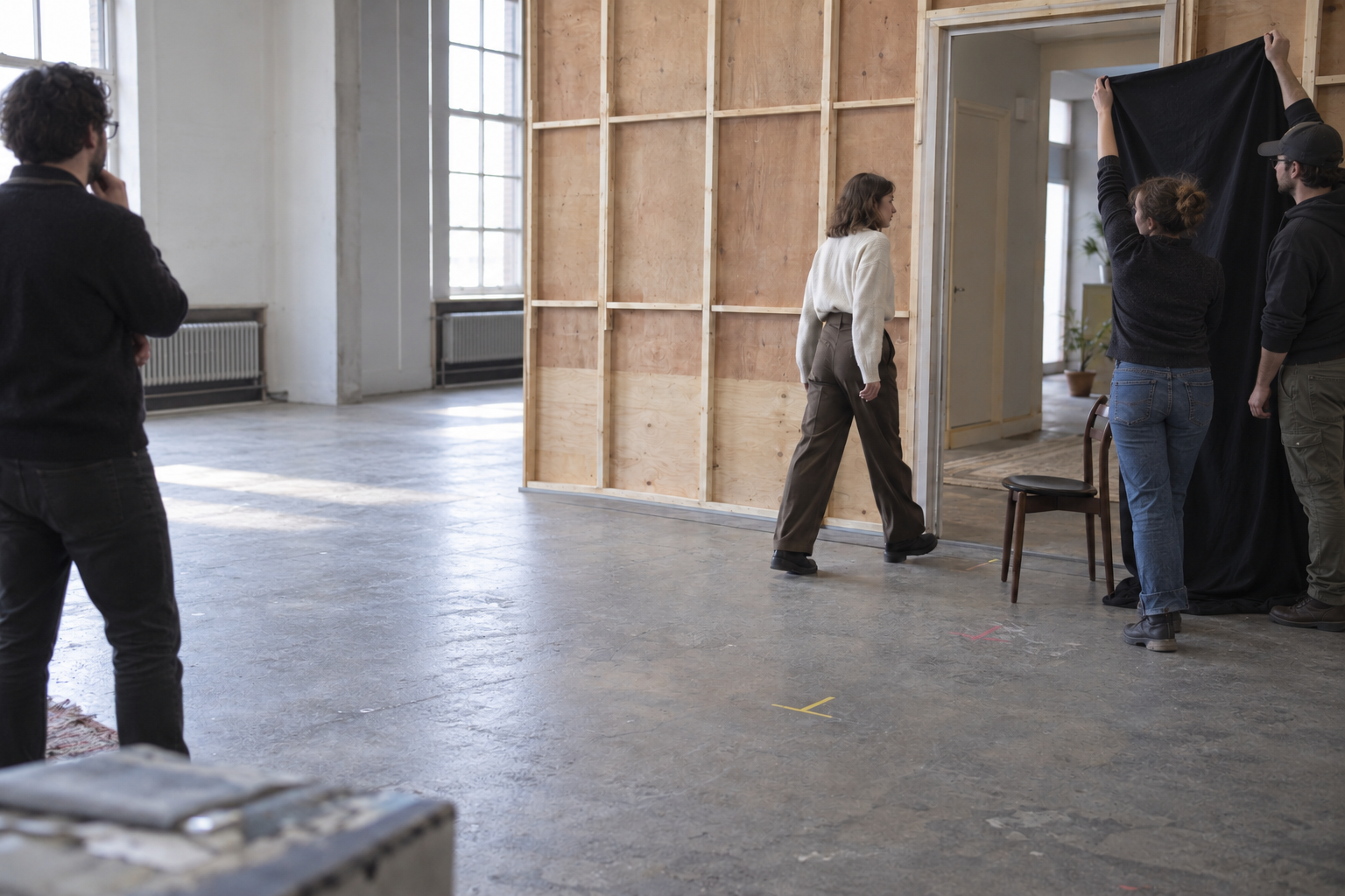
A compelling close-up is only one part of a commercial. The performer may turn, cross the room or handle the product. Coverage then has to preserve a coherent visual idea across different positions and sizes of shot.
Negative fill makes that relationship tangible. A surface that contributes useful shape in one position may affect the performer differently after a move. The production has to consider the lighting together with blocking and coverage, rather than treating the approved close-up as the entire solution.
That work depends on coordination across the commercial production roles. A creative decision becomes useful when the team understands how it fits the performance and the day’s work. A controlled studio environment can give that coordination a predictable setting, although consistency still requires deliberate decisions.
A quieter tool with a clear creative purpose
Negative fill is worth discussing because it makes visual intention concrete. The team is deciding how much of the surrounding light should reach the subject, and what that balance contributes to the story.
For us, the relevant conversation in commercial video production begins with the campaign’s visual character. Light, shadow, movement and the set should reinforce the same idea. Sometimes the most expressive contribution is the light a crew chooses to keep from returning.
Images are AI-generated illustrations of fictional production scenarios.