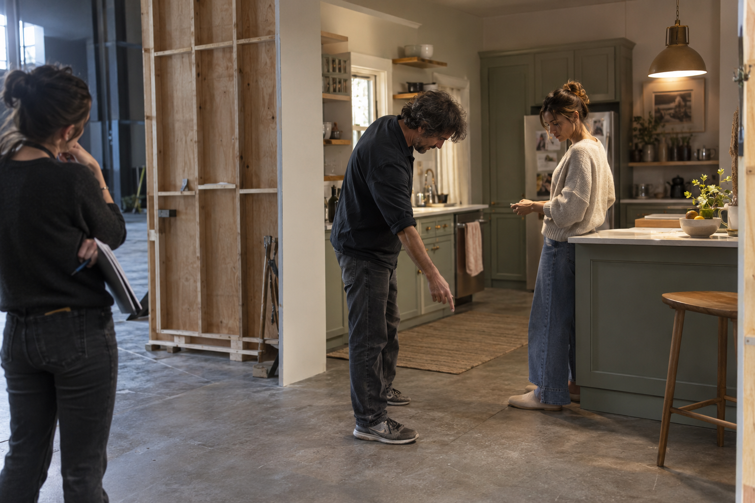
Lighting for commercial production shapes what a viewer can see, how a product's surfaces read and how a scene feels. Its main controls include light quality, direction, contrast, intensity and color. These work together: a soft source can still produce a strongly modeled face, and a bright scene can still contain deliberate shadows.
A useful lighting plan starts with the commercial's communication task. Does a hand movement need to be unmistakable? Should a ceramic surface feel tactile? Must the audience recognize a particular product color? Those questions give the cinematographer something more precise than a request for a premium or cinematic look.
This reference covers the fundamentals and how to discuss them during preparation. It uses an original hypothetical campaign for a cream ceramic serving pitcher. The example is a planning exercise, not an account of an In Color Studios production or a tested lighting setup. Electrical distribution, overhead rigging and fixture-specific operating instructions belong with qualified crew and the relevant equipment documentation.
Begin with the image the commercial needs
Before discussing lamps, identify the important visual information. In the fictional pitcher campaign, the audience should understand the handle, the pouring action and the glazed surface. A beautiful reflection that obscures the handle would work against that purpose. A dramatic face may be less important than seeing the performer's grip.
Separate the intended impression from the practical requirement. “A calm breakfast scene” describes a feeling. “The spout and hand must remain readable through the pour” describes something the image has to accomplish. Both belong in the conversation, but they answer different questions.
References become more useful when their qualities are named. Point to a gradual shadow transition, a bright background or a warm practical lamp. Explain which part matters. A single reference may contain lighting, production design, grading and wardrobe choices that cannot all be reproduced by moving a light.
The aim is a shared description the crew and approvers can evaluate. For this campaign, that might be an open morning atmosphere with enough shape to distinguish the pitcher from the table. It leaves room for professional interpretation while keeping the product's job visible.
Light quality describes the shadow transition
Hard light produces a relatively defined shadow edge. Soft light produces a more gradual transition. The effective size of the source as seen from the subject matters, including its distance. A source that appears large to a small tabletop object can appear much smaller to a performer farther away.
Diffusion is one way to change that relationship. The illuminated material becomes a broader emitting surface. Rosco's diffusion guidance explains that material positioned at a fixture and material placed in a separate frame can produce different effects. Adding diffusion is a change in how light reaches the subject, not simply a request to turn brightness down.
For the pitcher scene, a broad window treatment could create a gentle transition around the curved body. A more defined shadow could instead emphasize the spout's outline. Neither result is automatically more appropriate for a commercial. The choice depends on which features and feeling need emphasis.
Keep softness separate from shadow depth. A large source can make a gentle shadow edge while the unlit side remains comparatively dark. Filling that side changes the balance. Asking whether an image needs a softer edge or a lighter shadow helps the crew solve the actual problem.
Direction and lighting roles describe different things
Direction concerns where light arrives relative to the subject and camera. It affects which surfaces are emphasized and where shadows fall. The same pitcher can look quite different when the camera sees its lit side, its shadow side or a narrow edge of light.
Lighting roles describe functions. The key establishes the principal illumination. Fill adjusts shadow visibility. A separation light can distinguish a subject from the background, while background lighting shapes the space behind it. ARRI's Lighting Handbook provides a useful reference for this vocabulary.
These names do not require four separate fixtures. A window may provide the key, a wall may return fill, and a practical lamp may contribute to the background. Conversely, several sources may combine to perform one function. Three-point lighting is a useful way to describe relationships, not a mandatory equipment count.
In the fictional breakfast scene, the apparent window direction could give the action a consistent visual logic. If a closer angle makes the pouring hand disappear into shadow, the team needs to reconsider that angle's treatment. The goal is an intelligible sequence, rather than preserving a diagram at the expense of the action.

Contrast depends on the whole frame
Contrast concerns differences between lighter and darker areas. Consider the subject's lit and shadow sides, its separation from the background and the relative prominence of objects around it. An image can have a gently lit face but a conspicuously bright background that draws attention away.
Fill is one part of this balance. Reflected light from the room also matters. Our focused article on negative fill lighting explores how reducing unwanted return can give a subject definition. That is a local control of illumination, rather than lowering the entire exposure.
For the pitcher campaign, first judge whether the cream body separates from the tabletop. If both merge, adding more general brightness may not answer the problem. The team can discuss the background, the product's orientation and the lighting relationship together.
Be specific when discussing ratios. A numerical ratio is useful only when everyone understands what was measured and how. This guide does not prescribe one value for commercial work. An approver is usually better served by checking whether the intended detail survives in the agreed viewing conditions.
Intensity and exposure also deserve separate discussion. Changing the level of one source can alter a relationship inside the scene. Changing the camera's exposure affects how the image is recorded more broadly. Neither decision should be evaluated without looking at the product, performer and background together.
Product lighting includes the reflections
A reflective object records something about its surroundings as well as its own shape. Light sources and nearby surfaces can appear as highlights or reflections. Their placement is therefore part of the picture even when they sit outside the camera's frame.
The Corning Museum of Glass's reflector study demonstrates how cards can provide fill, define edges and reveal surface detail in glass objects. That is a still-photography reference, not a ready-made moving-image recipe. Its useful lesson here is to inspect what the surrounding surfaces contribute.
In our hypothetical ceramic campaign, the glaze might carry a bright reflection across the body. The creative question is whether that reflection describes the curve or distracts from it. Removing every highlight could make the finish harder to understand. Keeping every highlight could hide the form.
A polished tray beside the pitcher creates another surface to consider. It may reflect a different part of the room. Treat the arrangement as a relationship between product, set, camera and illumination. Changing the camera angle can matter as much as changing the light.
Check the full action. A pleasing reflection in the resting position may travel across the product during the pour. Rehearse the lift, turn and return, watching the handle, spout and liquid path throughout. A still frame cannot establish whether the whole shot communicates.
Color needs more than a warm or cool label
Color temperature describes a source's relative warm-to-cool character in kelvin. Lower values generally describe a more amber appearance and higher values a bluer one. Rosco's color reference also explains why daylight varies and why different source types require more consideration than one nominal number.
In a room with a window and a practical lamp, the team can choose to bring their appearances closer or preserve a deliberate difference. The decision should support the scene. A warm background lamp could suggest a different area of the room without requiring the product itself to take on the same cast.
White balance establishes the camera's treatment of the illumination. It does not independently neutralize every source in a mixed scene. Discuss what should read as neutral, which differences should remain and what the colorist needs to preserve.
CCT is not a complete description of color behavior. Rosco's film-lighting overview distinguishes color accuracy and green–magenta shifts as practical evaluation questions. Two sources set to the same kelvin value should still be checked with the actual camera and materials.
For the cream pitcher, review the ceramic, skin and any campaign colors together. A treatment that feels attractive on the room may alter the product impression. Establish the intended reference and approval route before the shoot rather than leaving everyone to remember a color from a different display.
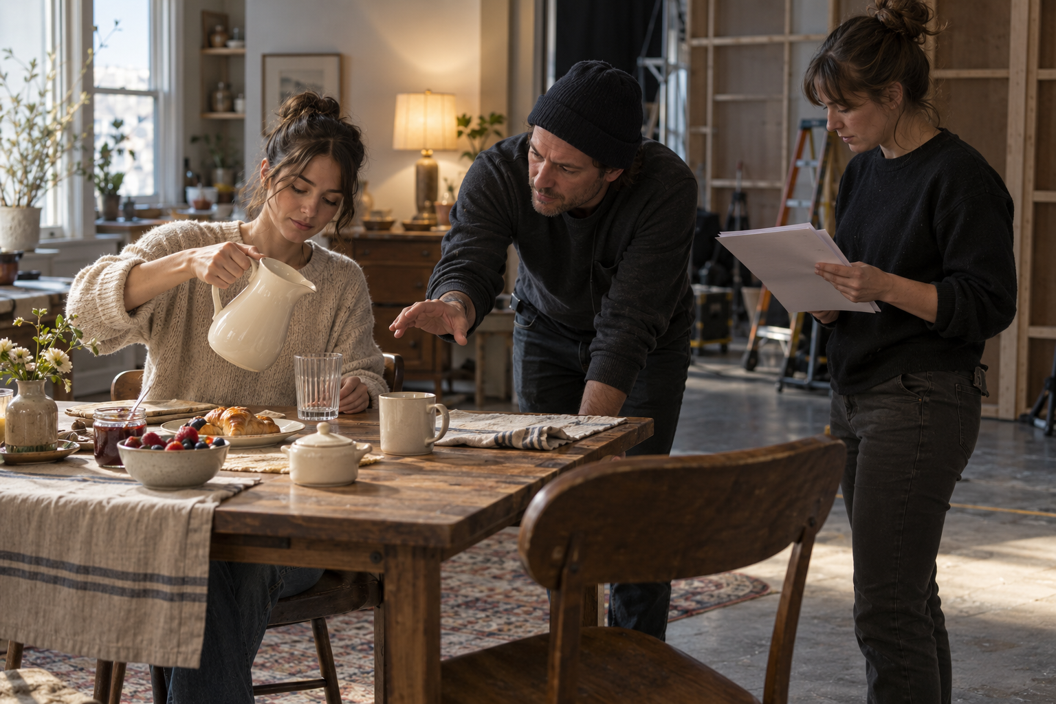
Build a plan that survives movement and coverage
Lighting preparation belongs within the stages of commercial production, alongside the shot plan, design and schedule. Identify the principal action, camera positions, product details and required versions before deciding how much control the location needs.
For the fictional campaign, the wide view establishes breakfast, the closer view explains the grip and pour, and the final product view leaves space for the message. These shots do not need identical lamp positions. They need a coherent relationship that makes sense when edited together.
Walk through the performer's movement. Note where the pitcher turns, where a hand crosses its surface and where the camera sees a reflection. If the campaign requires both horizontal and vertical compositions, inspect both. A source or card outside one frame may intrude into the other.
Plan for changes in available light and for the time needed to reset. A window is part of the schedule as well as the image. If the scene must match across a long day, discuss how the desired appearance will be maintained and what compromises are acceptable.
Test motion recording as well as appearance. ETC recommends testing LED lighting for flicker in real conditions. Use the intended camera, frame rate, shutter and relevant dimming settings, including any slow-motion requirement. Review recorded playback. A comfortable-looking room is not proof of a clean camera recording.
Review the result against the brief
A lighting review is most useful when it names a visible outcome. For this campaign: can we recognize the handle, follow the pour, read the glaze and keep attention on the product? If a change improves one part while weakening another, compare those consequences explicitly.
Keep the viewing treatment understood. Identify the current display transform or preview look and distinguish it from final grading. Record the approved reference so later conversations concern the same image rather than competing memories.
Continuity notes should capture more than fixture settings. Record the important positions and relationships, camera setup, product orientation and the reference frame. Note approved changes between angles. A photograph of the working set can help the crew reconstruct a relationship, but it should support a clear record rather than replace one.
For brands discussing video production services, a useful starting point is the information the image must communicate and the impression it should leave. The lighting team can then develop the means. Quality, direction, contrast and color give that conversation a vocabulary, while rehearsal and review reveal whether the choices work together.
Images are AI-generated illustrations of fictional production scenarios.Related Production Articles